Better Tea Co.
Packaging Design
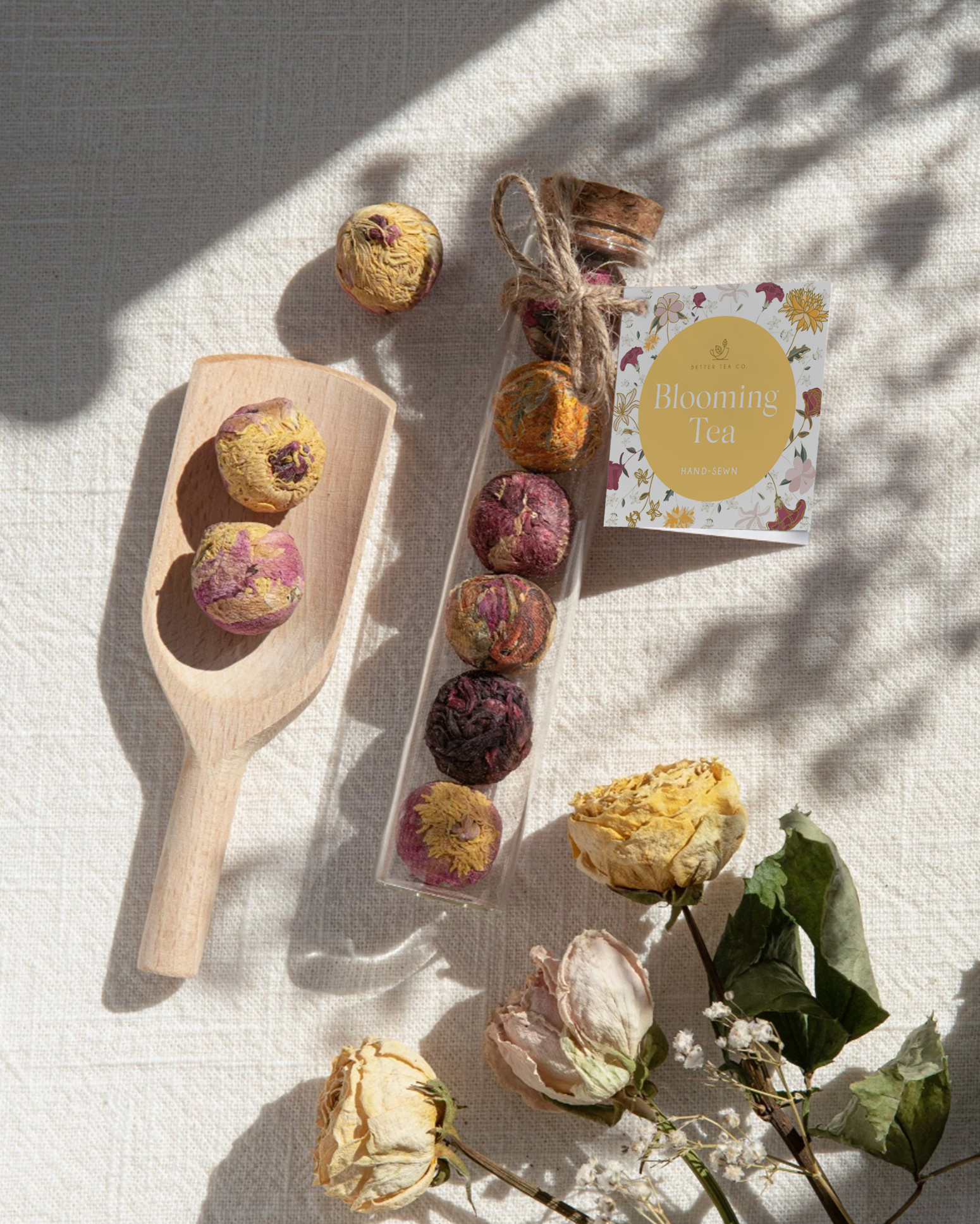
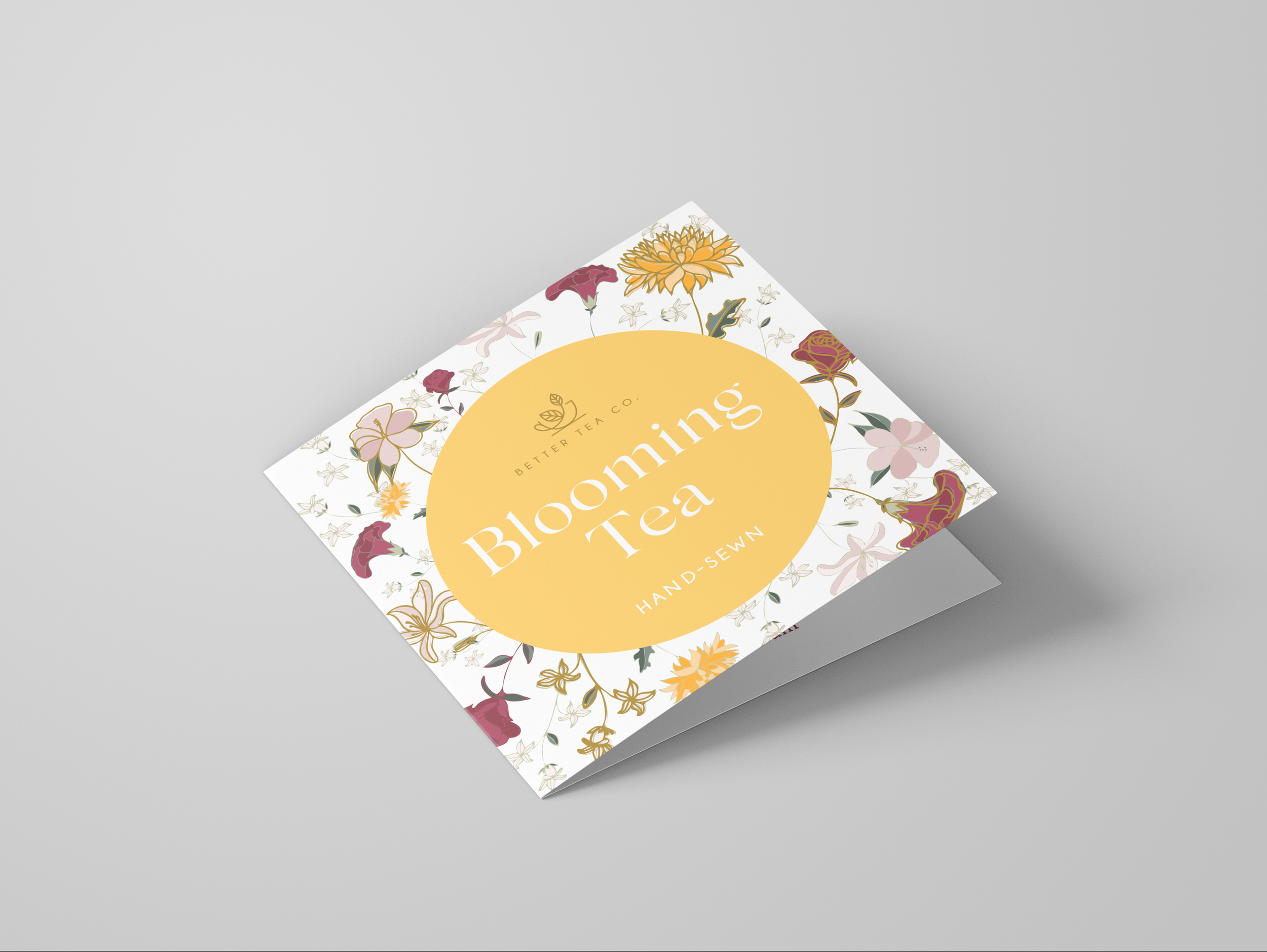
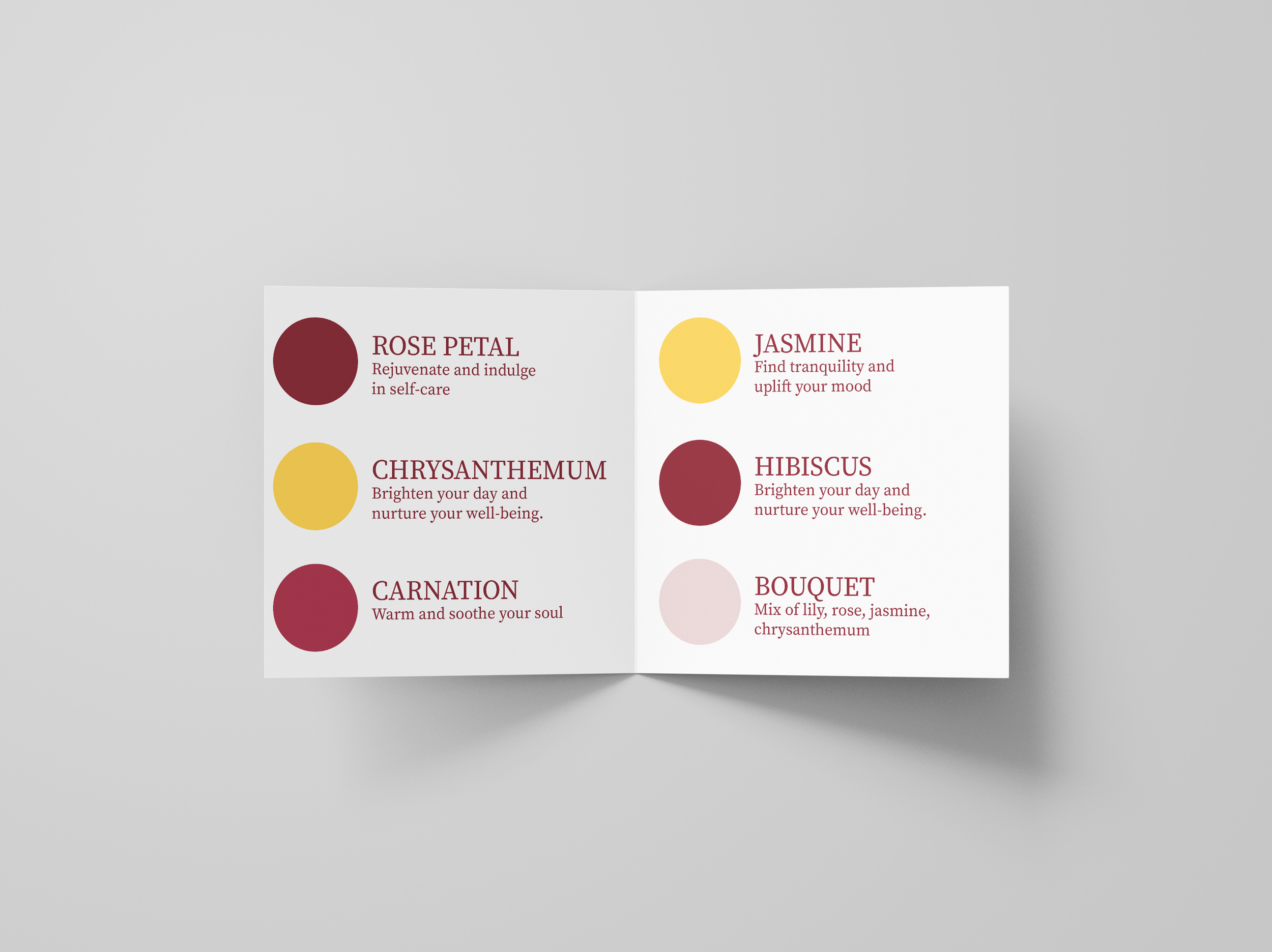
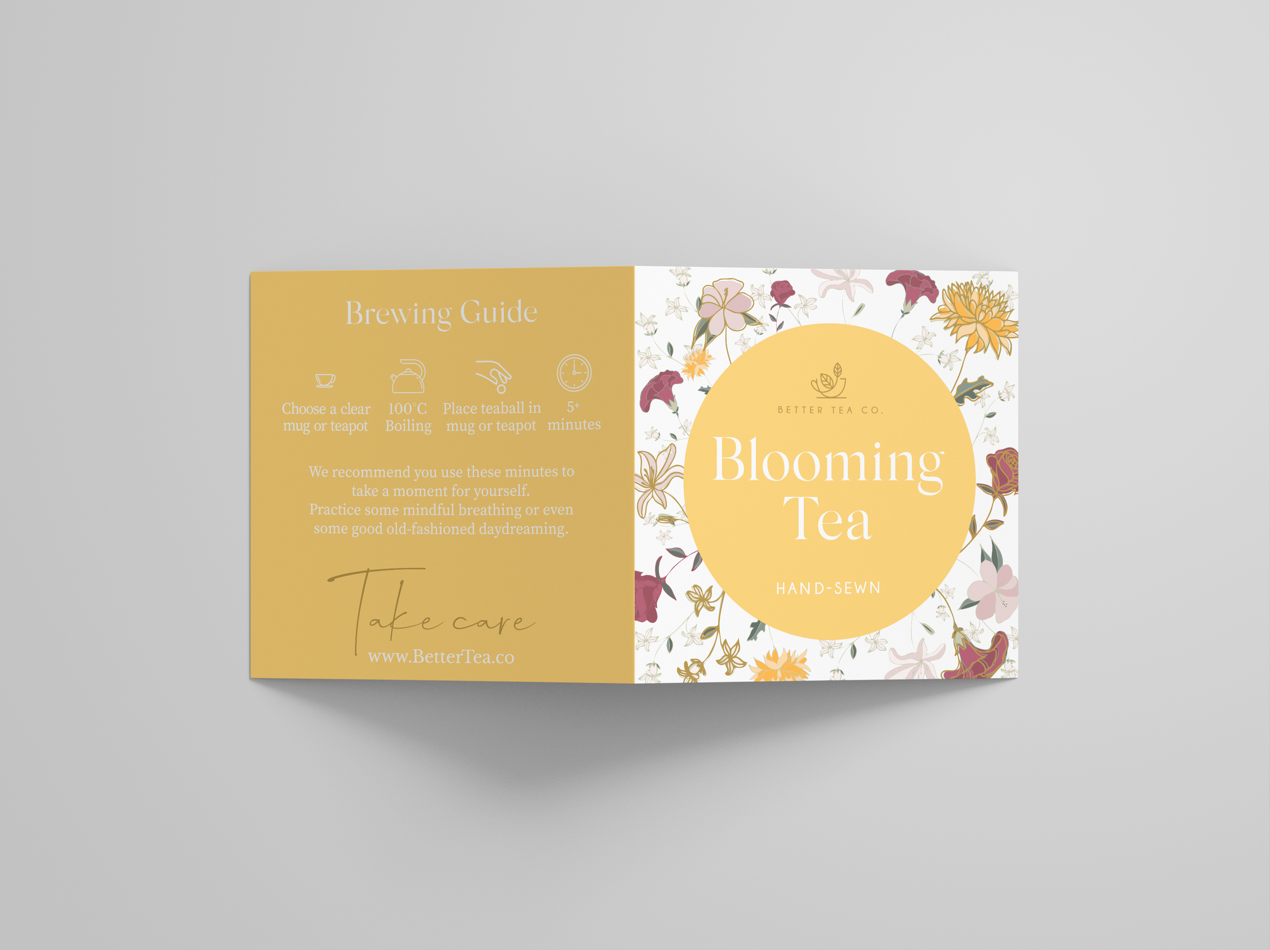
Better Tea Co’s blooming tea balls are one of their most popular products, but their existing label no longer felt fully aligned with the rest of the brand’s tea range. The aim of this project was to redesign the label so it felt more cohesive within the overall product lineup, while still allowing the blooming tea balls to retain their own sense of identity.
To achieve this, colours from Better Tea Co’s main tea range were incorporated into the new label design, creating a stronger visual connection across the brand. A soft yellow was then introduced as an accent colour — giving the blooming tea balls a distinct presence on shelf without pulling away from the established brand palette.
The result is a refreshed label that feels intentional and balanced: clearly part of the Better Tea Co family, yet recognisable as something special within the range.